
How do you make a bar chart with 200 values? If the distribution of values is skewed, you can make a packed bar chart instead.
A skewed value distribution (“long tail”) means there are a few large values and many small values. When the larger values are more important than the smaller values, that’s ideal for applying the data visualization principle of Focus+Context. Start with a regular bar chart of the top, important, categories as focus and pack the smaller values into the unused space as context.
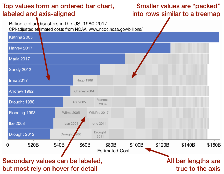
Features of packed bars
- The blue “primary” bars form a regular “top 10” bar chart, with all the familiar advantages in visual encoding and labeling.
- Smaller “secondary” values are unaligned yet are still encoded with length along the same axis.
- Smaller values are ordered left to right by size, using the left edges of their bars.
- Knowing the number of rows, we can estimate the percents of total (“part-to-whole”) for the top values. In the example above with 10 rows and Katrina’s cost taking the entire first row, we know that Katrina’s cost is at least 10% of the total of all the disasters.
- Knowing the number of rows, we can estimate the grand total. In the example, the right extent of the bars is just under $160B, so the grand sum is 10 times that, just under $1600B.
Drawbacks
- The values in each row are not related to each other, but the resemblance to a stacked bar chart suggests there is some relation.
- Without a skewed distribution, the secondary bars can swamp the primary bars.
